Collapse
CollapsingX
  • - or -

Configuring input elements


There are 7 types of input elements: Button, CheckBox, DropDownList, ListBox, RadioButton, TextBox, and ToggleButton elements. The following provides a basic methodology for configuring input elements that have been added to the operator view.

General properties

Input elements share general properties that allow them to function as an interface between the operator and the Matrox Design Assistant project. Most input elements can be: bound, conditionally enabled, automatically submitted, or used for flowchart execution.

Binding

Binding allows input elements to affect flowchart steps, platform configuration settings, and variables during runtime. This enables the operator to control the flowchart quickly and directly.

A flowchart step input is a property of a flowchart step which controls how that specific step behaves (for example, a BlobAnalysis step has a Threshold property that can have an integer passed to it as input). To bind an input element to a flowchart step input, click the arrow to the right of the Bound target dropdown list of the selected input element, and select Link a value. Select In, and navigate the tree structure to the step and input you want to bind.

A platform configuration setting is one that affects the entire project. It typically controls an aspect of a project's system, camera, timer, I/O, or communication settings. To bind an input element to a platform configuration setting, click the arrow to the right of the Bound target dropdown list of the selected input element, and select Enter an advanced value. Select Platform, and navigate the tree structure to the setting you want to bind.

Note that while the tree structure, presented when you select Platform, does display all platform configuration settings, not all platform configuration settings can be directly bound to an input element in the operator view.

A variable is a user-defined storage location in memory that represents a value or collection of values that can change. To bind an input element to a variable, select the variable's name from the Bound target dropdown list of the selected input element, or create a new variable by clicking on the adjacent Plus button. You can click on the Manage Variable button to create new variables and edit existing ones.

Note that step inputs bound to operator view input elements have a next to them.

For more information on platform configuration settings and variables, see the Platform Configuration dialog reference chapter and Chapter 25: Variables and the Store step, respectively.

Conditionally enabling an input element

All input elements have an Enable property which is set to True by default. When set to False, the input element is grayed out in the operator view. This can be used to simplify the interface by only enabling choices that are relevant to the current mode (for example, training or inspecting modes). The value of the Enable property is normally either kept as True, or set to a boolean expression or variable.

For example, you could use 2 RadioButton elements to switch from one mode to another, with each mode having a different set of active elements. To do so, bind each RadioButton element to a different boolean variable. Then, set the Enable property of one set of elements, such that, in one mode, one set of elements is enabled while the other set is disabled.

A more concrete example can be found by opening the Switch between camera or disk example, accessible by clicking on the Browse Examples link on the Quick Start tab. This example is discussed at length in the Controlling image acquisition from the operator view section later in this chapter.

Execute flowchart

Most input elements have the ability to trigger the execution of a flowchart. To configure this ability, select Execute Flowchart as an action (for example, in the case of the Button element) or configure it through the EXECUTE FLOWCHART tab in the Configuration pane.

For more information about executing flowcharts and other actions, see the Events and actions section in Chapter 2: Building a project.

Automatic submit

The Automatic submit property is a legacy property that can be toggled under the Advanced editor in the Configuration pane. The default state for all input elements is to have the Automatic submit property enabled and have the input value sent immediately to the flowchart upon entry. This typically allows a quicker response time and a more intuitive interface. However when it is necessary that the flowchart receive several inputs simultaneously, you can disable the Automatic submit property and create a submit button.

Configuring a CheckBox element

The CheckBox element returns a boolean value and can be directly bound to a flowchart step input, platform configuration setting, or variable. Perform the following to configure the CheckBox element:

  1. Click on a CheckBox element in the operator view. In the Configuration pane, set Initial Checked State to either True or False.

  2. Bind a flowchart step input, a platform configuration setting, or a variable. See the Binding subsection of this section above.

Configuring a DropDownList or ListBox element

The DropDownList and ListBox elements return a string or number that the operator selects from a predefined or dynamically-generated list. The selected value is then returned to a bound flowchart step input, platform configuration setting, or variable. Perform the following to configure these elements:

  1. Select the element in the operator view. From the list of values in the Configuration pane, you can add, remove, or rename the string or numeric values that will appear in the element. For each item in the list, you can specify a name that the operator will see, and a corresponding value that will be used in the flowchart.

  2. To make the list from the reserved constants used by a property of a flowchart step (for example, the Low, Medium, High, and VeryHigh values of the Speed property of the PatternMatching step), click on the Add Constants button. Then, in the displayed tree structure, navigate to the relevant property. All the possible values are shown on the right side. Select the ones that you want to appear in the list and click on the OK button.

    To define dynamically-generated values for the list, click on the Dynamic tab. Set the PossibleNames property to a string array of names in the evaluate-to-string operator ({}), and set the PossibleStringValues property to an array of strings or numbers, also in the evaluate-to-string operator ({}). Each array must contain the same number of elements.

    Dynamic values are refreshed when items referenced by the expression (in the list of values) change.

  3. To re-order a static list, highlight the value that you want to move and click on the arrow buttons to the right of the list.

  4. Set the initial value to one of the values entered. By default, the Initial value checkbox is selected next to the first item in the list. Note that there can be only one initial value.

  5. Bind a flowchart step input, a platform configuration setting, or a variable. See the Binding subsection of this section above.

  6. Optionally, set the font size in the Advanced editor of the Configuration pane.

  7. Optionally, you can have inputs added to a validation set by selecting the validation toggle button in the top-right corner of the inputs Configuration pane. For more information see the Project Change Validator overview section in Chapter 62: Project Change Validator.

Configuring a RadioButton element

The RadioButton element returns one of a set of values to a bound flowchart step input, platform configuration setting, or variable. RadioButton elements must exist in groups of at least 2. Perform the following to configure the RadioButton element:

  1. Click on the RadioButton element in the operator view. In the Configuration pane, set Group to the name of the group to which the RadioButton belongs.

  2. Set Value to the value that the RadioButton element will return.

  3. Bind a flowchart step input, a platform configuration setting, or a variable. See the Binding subsection of this section above.

  4. Set the initial value of the bound flowchart step input, platform configuration setting, or variable to determine the initial value of the RadioButton elements. The initial value of the bound target sets the initial value of the RadioButton group.

Configuring a TextBox element

The TextBox element returns an operator-specified string or number to a bound flowchart step input, platform configuration setting, or variable. Perform the following to configure the TextBox element:

  1. Click on a TextBox element in the operator view. In the GENERAL tab of the Configuration pane, set Input Type to String or Numeric.

  2. You can choose to accept only values in a certain range of numbers. To do this, set the Value Constraint and the valid upper and lower bounds for the input. When an operator makes an invalid input, the background will appear pink, and no data will be sent to the flowchart. If Input Type is set to Numeric, you can also select whether to allow floating-point numbers.

  3. Bind a flowchart step input, a platform configuration setting, or a variable. See the Binding subsection of this section above. You can specify the initial value displayed by the TextBox element at runtime by setting the initial value of the bound target.

It can be useful, especially when working with a touchscreen, to add Button elements that increment or decrement a value in a TextBox element by a fixed number. To do this, see the Increment and Decrement TextBox subsection of the Buttons section later in this chapter.

If you need to ensure that a string input from a TextBox element is valid, you should bind the TextBox element to an intermediate variable. Whenever the contents of the TextBox element is changed, execute a flowchart which removes illegal characters from the variable. For example, you might remove the characters ".", "[", "\", and "}" using a Store step with the REPLACESTRING function in the following operations:

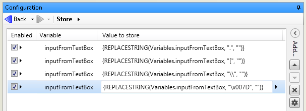
"007D" is the hex code for the closing curly bracket "}".

After this Store step has been executed, you can use a subsequent Store or Reconfigure step to copy the value to a variable or step input.

Configuring a ToggleButton element

The ToggleButton element returns a boolean value to a bound flowchart step input, platform configuration setting, or variable. Perform the following to configure the ToggleButton element:

  1. Click on a ToggleButton element in the operator view. In the Configuration pane, set Initial Pressed State to either True or False.

  2. Enter values for the appearance of the button. The ToggleButton element has a single Font size, but can have Text, Text Color, and Background Color for the pressed and unpressed state.

  3. Bind a flowchart step input, a platform configuration setting, or a variable. See the Binding subsection of this section above.