Displays
 Previous
The Display element of the operator view has several annotation and labeling options.
 Configuring
a Display element
Configuring
a Display element
To configure the Display element, perform the following while in the operator view :
-
Select the Display element. Check its Image property to ensure that the Display element is linked to the required image source. This is the image that will be displayed.
-
Configure the size of the Display element. You can resize the Display element by clicking and dragging the corners and edges of the element itself, or by adjusting its Width and Height properties directly. When changing the size of the display, the underlying image can be scaled or cropped. Configure the ScaleElement property, ImageAlignment property, and Zoom property, to adjust the image. You can also choose to display the image in pseudo-color using a Colormap, for information on the colormap options, see the Displaying images using a colormap section in the Display view reference chapter.
Note that the user can adjust the zoom of a Display element at runtime by scrolling up or down with the mouse wheel.
-
Set the SelectionRadius property. When the Display is in interactive mode, the selection radius specifies how close a mouse click needs to be to a graphic to select it. It is useful to adjust the selection radius if the operator might have a low level of precision when using the operator view (for example, if they have a touch panel with low touch resolution, they don't have a stylus, or if they are wearing gloves).
-
Optionally, set the Display element to display only a portion of the entire image, referred to as the Display Region. Configure the region by specifying its shape settings, or click on the Use existing region... button to link a value.
-
Optionally, add annotations to the display. Annotations are shapes and text that you can add to a Display element, or that can be provided by a flowchart step. Annotations provided by a flowchart step (for instance, the BlobAnalysis step commonly provides a BlobContours annotation) are called step annotations. Shapes and text that you create are called user-defined annotations. Both kinds of annotations and their configuration steps are discussed below.
Some optional but useful properties that annotations can have are: editability, dynamic color, replication, and labels. All of these properties are customizable and are discussed in their respective sections below.
-
Optionally, you can have the display added to a validation set by selecting the Recorded for validation (
 )
toolbar button in the
Navigation toolbar. For more information, see the
Project Change Validator overview section in
Chapter 62: Project Change Validator .
)
toolbar button in the
Navigation toolbar. For more information, see the
Project Change Validator overview section in
Chapter 62: Project Change Validator .
Adding an annotation to a
Display element
Labels
Labels are text that can be attached and displayed next to most annotations; text annotations cannot have labels. A label's text can be a combination of constants, string expressions, and predefined options.
To add a label to an annotation, enable its Show label property. You can enable the label conditionally if you want it to appear only under specific conditions.
After enabling the label, you can enter additional label information. For example, you can specify some common predefined annotation-dependent options that are available to display, or you can type in a custom string. Some annotation-dependent options include: Index for step results with multiple occurrences or replicated shape annotations, Model name for models' search regions, and Marker name for marker regions. If you want to include multiple pieces of information in the label, switch to the Advanced editor to build a text expression.
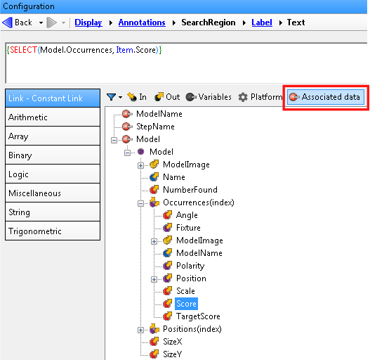
When you add labels to step annotations, the label has access to information from the step to which it is applied. To see available information, use the Advanced editor to access Associated data. For example, you can add a label that displays a model occurrence's score from the ModelFinder step.
Note that, if you add an expression to a step annotation label, the information displayed is restricted to what is available at the present step or at a previous step. You cannot, for example, display information from a Store step variable if the Store step is located after the present step in the flowchart. To avoid this problem, use a user-defined annotation (such as Replicated shape) and add the required expression to the annotation label. Available annotation labels in the Shapes and text group are evaluated at the publishing point and have access to all previous step results as well as variable results (such as those defined in the Store step).
User-defined
annotations
You can add various shapes and text as annotations to a Display element; these annotations are called user-defined annotations. For each shape, you must specify its dimensions and location (accessible by clicking on the Configure shape button). Each shape has different properties for specifying its dimensions.
Some user-defined shapes can be made editable at runtime, or bound to a shape of the same type in a step, typically a search region. For more information, see the Editable annotations and binding subsection of this section.
Coordinate
system
Replicated
shapes
Replicated shapes are a type of user-defined annotation that you can draw multiple times, each in relation to an array element, such as those in a fixture array. For example, you can draw a shape at each occurrence of a ModelFinder step's model. A replicated shape can be a rectangle, elliptic arc, elliptic ring sector, or polygon.
Note that a replicated circle is possible by replicating an elliptic arc with a start angle of 0, an end angle of 360, and both its width and height set to the same value.
To create a replicated shape, select Replicated shape in the Shapes and text option that appears once you have selected to add an annotation. To configure a replicated shape after creating it:
-
Select the replicated shape annotation and navigate to the Shape settings (in the Configuration pane) by clicking on the Configure shape button.
-
Select the required shape from the Select a shape dropdown list. Each shape will have a different set of inputs to configure to specify its size, orientation, and position. Keep in mind that the position and orientation of a replicated shape is with respect to each fixture in the specified array.
Note that text is not available as a replicated shape; if you want to repeat text multiple times, see the Labels subsection of this section instead.
-
Specify the array of fixtures from which you want to place your replicated shapes, using the Fixtures text box. The default option is Custom, which takes 3 arrays of values: X-position, Y-position, and angle, respectively. The number of elements in the 3 arrays should be equal and will determine the number of replications. There is one exception: if an array contains only one element, Matrox Design Assistant repeats that element to match the number of elements in the other arrays. For example, setting [0] for angle will cause all the elements to be at 0 degrees.
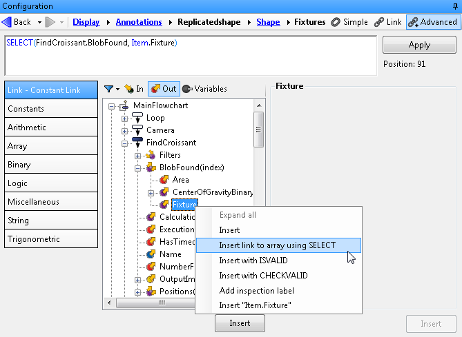
If you want to select an existing array of fixtures, navigate to the Fixtures text box, click the Alternate options button, and select Enter an advanced value..., or click inside the Fixtures text box and press F8, to open the Advanced editor. If you want to use all the fixtures in a step output (for example, all the blobs that were found), navigate in the linked tree structure to the fixture output (for example, MainFlowchart.FindCroissant.BlobFound(index).Fixture). Right-click the fixture and select Insert link to array using SELECT. A SELECT function will be automatically entered.
To use a subset of an existing array according to elements that satisfy a condition, you must enter a custom expression. Use the FILTER function (for example, FILTER(BlobAnalysis.BlobFound, INRANGE(Item.Area, 50, 60), Item.Fixture)). To specify any other kind of fixture array, use the FIXTUREARRAY function. For information about using arrays, see Chapter 27: Using arrays.
Note that all replicated shapes of a single annotation have the same color. To set the replicated shapes to display in a different color based on a condition, create 2 similar replicated shape annotations of different colors, and each using a different array or subset of an array of fixtures. For instance, if the above subset of fixtures create a yellow circle to outline the blob, the opposite subset, FILTER(BlobAnalysis.BlobFound, OUTOFRANGE(Item.Area, 50, 60), Item.Fixture) could be set in another annotation set to create blue circles.
Setting
annotation color
Annotations can have either fixed color or dynamic color. You can configure an annotation's color settings by editing it in the Configuration pane.
Fixed color
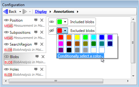
for annotations
Annotations can be drawn in a fixed color by selecting the color from the available list of colors when editing the annotation. Some step annotations require that they are drawn in a different color depending on the state of the step or the states of the information they represent (for example, when drawing blobs, you can draw included and excluded blobs in different colors in the same annotation). In this case, the different possibilities in which the annotation can be presented in a different color are listed, each with its own color and visibility selector.