
Page structure
 Previous
The operator view layout is a series of nested grids; you can place text, elements, and/or new grids in the cells of a grid.
 Operator view
templates and the default view
Operator view
templates and the default view
Operator view
grid layout
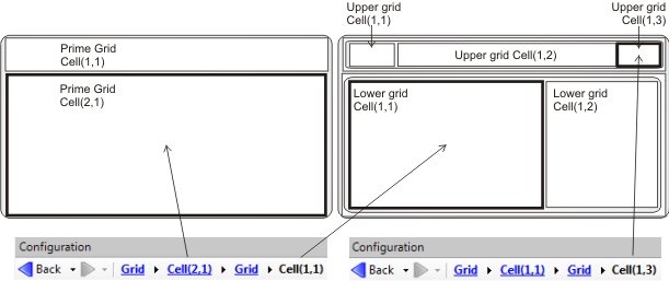
A grid contains one or more cells. Each cell in a grid is designated as a coordinate pair, with the first number being the row number, and the second, the column number. The top-left cell is Cell(1,1).
Each cell can either contain one or more grids, or one or more elements, though cannot contain both grids and elements. The former type of grid is called a grid structure, the latter is called an editable cell. Note that changing the type of cell, from grid structure to editable cell, or vice versa, will delete all the grids or elements already in the cell.
As a grid can contain a cell that contains a grid, this process can create a series of nested grids.
In the default operator view the grids are nested in 3 layers. The prime grid has 2 rows and one column. The image below left shows the prime grid and its 2 cells, Cell(1,1) and Cell(2,1). The image below right shows the next layer of grids, which are within each of the 2 cells of the prime grid. Note that the designation, Cell(1,1), only applies to a particular grid. Consequently, an operator view will have multiple cells called Cell(1,1). To correctly identify which Cell(1,1) you are looking at, you can view the series of nested grids that the currently selected cell is in at the top of the Configuration pane, as shown in both images below.
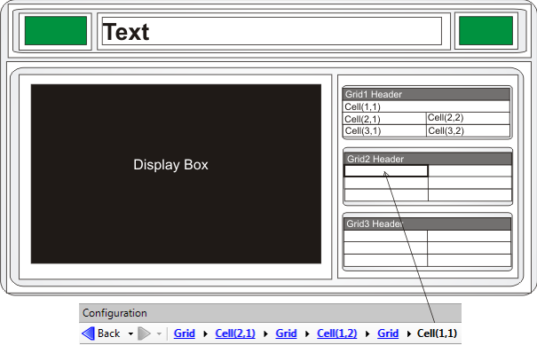
The following image shows the third layer of nested grids, and introduces elements. Note how a cell either contains grids or elements, but not both.
Grid, cell,
and element selection
Adding a row or
column
Moving
or adjusting cells and grids
To move a grid to any empty editable cell, select the grid and drag & drop it. In the process, the grid you move will resize according to the size of the cell it was placed in. Cells, elements, and free text can also be moved. Elements and free text can be moved individually to any editable cell in any grid, though a cell, with all its text and/or elements together, can only be moved to another editable cell in the same grid.
For example, to add a grid or elements to the left of the display element in the default page, select the parent grid of the display element. To do this, right-click on the display element and select Select Parent Grid from the context menu. (See the Grid, cell, and element selection subsection above for more on selection). Once the parent grid is selected, select the Columns radio button, then click the Add button. A new column, Column3, is added on the far right. To move it to the left, select Column3 from the window in the Configuration pane and click the Up arrow twice. Now there is an extra column, which contains a single cell. You can select the cell and either add elements, or change the cell from editable to a grid structure and add grids.
Merging cells
Adjusting the
size of cells
Styles and
formatting
The format of a grid, for example the font, background color, alignment, or border, is distinct from the format of each of its cells, which is distinct from the format of each of the elements within a cell. For example, a grid header could have bold text, some of its cells could have text in italics and other cells have underlined text, and the background color of a Value element could be green in one cell and red in another. Each cell, element, and grid is said to have its own inline style, which is adjustable using the tools in the Operator View Layout toolbar.
To have a consistent look for your entire operator view, you can
configure a grid or cell by using preset styles from the
Styles list
( ) toolbar button in the
Operator View Layout toolbar. There are 2 types of preset
styles: grid styles and cell styles; each type of style has its own
features. Grid styles control the format of the header and its
cells. Cell styles just control the format of the cell itself.
) toolbar button in the
Operator View Layout toolbar. There are 2 types of preset
styles: grid styles and cell styles; each type of style has its own
features. Grid styles control the format of the header and its
cells. Cell styles just control the format of the cell itself.
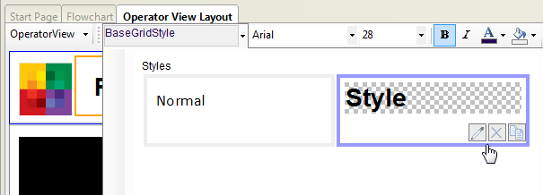
When highlighting a grid or cell, the style list displays either a set of grid styles or cell styles, respectively. Note that only the base grid style has a white background. The other preset grid style and the 2 preset cell styles have a transparent background. Consequently, you can change the color of the entire operator view by changing the background color of the base grid.
The preset styles are editable by clicking on the pencil button, which appears when you hover over a style in the style list. Clicking the pencil button will open up a dialog that allows you to customize the style. The format of either style includes cell padding and border format. Any change to a preset style will automatically change the format of everything that had that preset style. The 'X' button deletes the style, provided nothing uses it. The copy button creates a copy of the style, which can then be modified and renamed.
To change the border of a grid or cell, including removing the
border, select the Borders ( ) toolbar button in the
Operator View Layout toolbar while on the appropriate grid,
cell, or style, and alter the border thickness (0 for no border),
style, and/or color.
) toolbar button in the
Operator View Layout toolbar while on the appropriate grid,
cell, or style, and alter the border thickness (0 for no border),
style, and/or color.
To create a new style based on the formatting of a particular grid or cell, highlight the grid or cell and click on the New style from selected element button in the style list. Note that the selected cell, element, or grid will adopt this new style.
To change the format of all the cells in a grid, including the header, select the grid and apply a preset grid style. To change the formatting of one or several cells within a grid, select the cell(s) and either apply a preset cell style, or use the tools in the Operator View Layout toolbar.
Note that the format for the PassFail, Display, and Filmstrip elements cannot be modified by inline or preset styles. The format for the PassFail element can be modified in the Configuration pane.