Using the display graphs
There are 3 graphs that convey information about the selected step's displayed image: the Line Profile graph, the Histogram graph, and the Edge Values graph. To access these graphs, click on their corresponding toolbar buttons in the Project toolbar.
The Line Profile and Histogram graphs can display pixel intensity information about any steps' displayed image. The Edge Values graph can only display information about the displayed image of a Measurement step and an EdgeLocator step.
The graphs belong to the step in which they were created; that is, the graphs of a step are only displayed while the step is selected. This allows you to have multiple and unique sets of graphs for each step's displayed image. To use these graphs with depth maps, refer to the Line profiles and histograms for depth maps subsection of the Procedure for using a depth map section in Chapter 38: Working with depth maps for additional information.
 General features for all
display graphs
General features for all
display graphs
Line Profile
graph
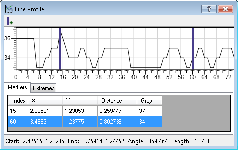
The Line
Profile graph shows the intensity at each pixel along a line.
The X-axis represents the distance along the line in calibrated
units and the Y-axis represents the pixel intensity. (For an
uncalibrated image, the X-axis represents pixel units). To use the
graph, select the step whose image you want to analyze, click on
the Trace a line
profile ( )
toolbar button, and then click on the image to draw a line. You can
move the line by clicking on it and dragging it to another
location. You can resize or re-orient the line by clicking on
either end of the line and dragging that end to another location. A
single step can have multiple line profiles.
)
toolbar button, and then click on the image to draw a line. You can
move the line by clicking on it and dragging it to another
location. You can resize or re-orient the line by clicking on
either end of the line and dragging that end to another location. A
single step can have multiple line profiles.
You are able to place graph markers anywhere along the graph to measure the distance between points on the line. The graph marker is shown both as a line on the graph, and as a small triangle on the line drawn on the image. You can drag the graph marker, either along the graph or the line drawn in the image. Below the graph is a table with data about the graph markers and the extremes of the entire line. The X- and Y-columns on the table represent the X- and Y-coordinates in the image. There is also information about the line itself, such as line angle and length, at the bottom of the window. By default, this information is in calibrated world units; to use pixel units, right-click on the image and uncheck the Calibrated Coordinates context menu item.
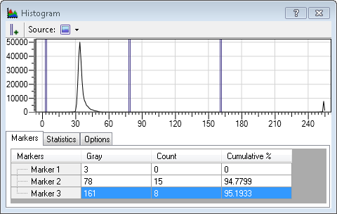
Histogram graph
The Histogram
graph is based on pixel data in the selected step's displayed
image. To see the graph, click on the View histogram
( )
toolbar button. The graph's X-axis represents intensity values and
the Y-axis represents the number of pixels in the image that have
that intensity.
)
toolbar button. The graph's X-axis represents intensity values and
the Y-axis represents the number of pixels in the image that have
that intensity.
By default, the Histogram graph is for the entire image. To have the Histogram graph display information about a region in the image, first choose the shape of the region by clicking on the Source button at the top of the Histogram graph, and then draw the region on the image. You can move the region once it is drawn. Moving the region dynamically updates the histogram graph.
The Histogram graph has a table that displays pixel information corresponding to where you place the graph marker in the graph. For example, you can establish the exact number of pixels (pixel count) in the region that have the intensity at which you placed the graph marker. The Histogram graph also has a table with statistical information about the entire region, such as the mean pixel value.
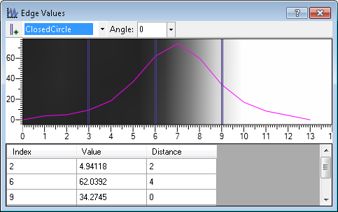
Edge Values graph
The Edge
Values graph indicates the edge strength of the edges in a
search region of the
Measurement step or the
EdgeLocator step's displayed image. To see the graph, click
on the View edge
values ( )
toolbar button in the Project
toolbar. You can use this graph to verify edge quality, stripe
width, and spacing.
)
toolbar button in the Project
toolbar. You can use this graph to verify edge quality, stripe
width, and spacing.
Edge strength is the output of the derivative filter used to locate edge candidates, where negative values correspond to bright-to-dark transitions and positive values correspond to dark-to-bright transitions. The graph's X-axis represents the distance from the start to the end of the search region, and the Y-axis represents the edge strength. The X-axis represents pixel units for uncalibrated images and world units for calibrated images.
For the Measurement step, you must create at least one edge, stripe, or circle marker before using the graph. If you have multiple occurrences of a measurement marker, you can select which one to use for the graph by selecting it from the dropdown list at the top of the edge values graph.
You can add graph markers on an Edge Values graph. These graph markers populate the table under the graph, which displays the edge strength at the graph marker's position, and the distance from the previous graph marker.